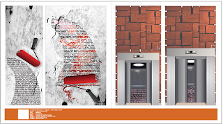
limitation
Friday, October 22, 2010
Tuesday, October 19, 2010
illustration board

This is our illustration board which contain 8 parts of different materials to form this art work...this art work represents the robots have seize a place in the evening time~from the top right to the left, we've used crayon, color pencil, poster color and arcylic, whereas the bottom part would be water color, soft pastel, stick v poster color.
Saturday, October 9, 2010
type as image~
80's era~
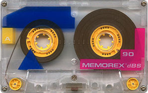
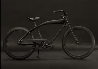
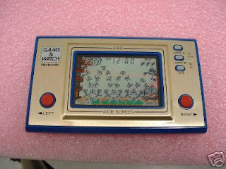
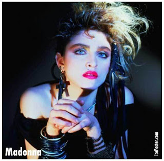
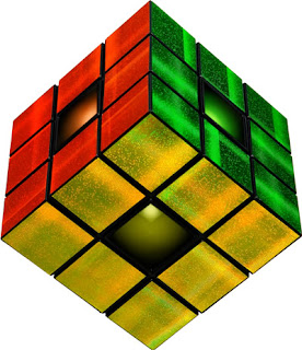
we need to a video which is about the 80's by flash player...we've learnt also motion tween, shape tween, guide, and masking...so, this video should be include these 4 elements... here is my research about 80's : rambo, madonna, rubiks revolution, yoyo, nintendo game player, radio, antique car, mcdonald's, burger king and so on...
Tuesday, October 5, 2010
illustration

this is an animal painting by color pencil...color painting should be layer by layer to tone up the image...so tat its contain rich colors inside...the dark n bright toning made the image more 3D n real...especially the hair painting n the fur painting... detail is the 1st condition to form an paiting image~whereby the eyes is the 1st part to start on painting...because its the spirit of the image!after all the thing have done, we need to spray xxx on the board so that the color wont fade away...then its finished!
Monday, September 6, 2010
Sunday, August 29, 2010
Geometry Shapes
In drawing class, we learned that actually every object is form by several geometric shapes such as cube, cylinder, cone, pyramid, sphere and so on. Because of these shapes so that it made the object 3D and not 2D (if using only square, circle, rectangle, triangle). We need to see through the object to understand the inner structure and outlook as well. So that we could rotate it into different angle by drawing out. Once u understand the structure of it, you can redraw the same thing with different angle or surface. First, we learn to use a shape to develop a character. Then we need to analyze the structure of a real object like lorry, motor, machine etc. to draw it out in solid (3D) way. Besides, we have to know the knowledge of perspective so that it could make a layout more interesting and 3D. We've learnt 1 point, 2 point, 3 point of perspective. Before we start to draw a layout, we have to practice on human drawing. For instances, the American style (X-men), manga style (comic). In between, teacher told us that actually comic is a hero for Japanese. It stand for a high place in Japan because it is a spirit support for them after the world waR 2. Comic is read by all classes or age levels of person.
Subscribe to:
Posts (Atom)


