Friday, October 22, 2010
Tuesday, October 19, 2010
illustration board

This is our illustration board which contain 8 parts of different materials to form this art work...this art work represents the robots have seize a place in the evening time~from the top right to the left, we've used crayon, color pencil, poster color and arcylic, whereas the bottom part would be water color, soft pastel, stick v poster color.
Saturday, October 9, 2010
type as image~
80's era~
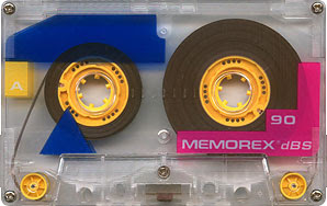
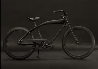
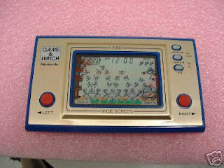
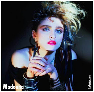
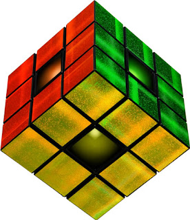
we need to a video which is about the 80's by flash player...we've learnt also motion tween, shape tween, guide, and masking...so, this video should be include these 4 elements... here is my research about 80's : rambo, madonna, rubiks revolution, yoyo, nintendo game player, radio, antique car, mcdonald's, burger king and so on...
Tuesday, October 5, 2010
illustration

this is an animal painting by color pencil...color painting should be layer by layer to tone up the image...so tat its contain rich colors inside...the dark n bright toning made the image more 3D n real...especially the hair painting n the fur painting... detail is the 1st condition to form an paiting image~whereby the eyes is the 1st part to start on painting...because its the spirit of the image!after all the thing have done, we need to spray xxx on the board so that the color wont fade away...then its finished!
Monday, September 6, 2010
Sunday, August 29, 2010
Geometry Shapes
In drawing class, we learned that actually every object is form by several geometric shapes such as cube, cylinder, cone, pyramid, sphere and so on. Because of these shapes so that it made the object 3D and not 2D (if using only square, circle, rectangle, triangle). We need to see through the object to understand the inner structure and outlook as well. So that we could rotate it into different angle by drawing out. Once u understand the structure of it, you can redraw the same thing with different angle or surface. First, we learn to use a shape to develop a character. Then we need to analyze the structure of a real object like lorry, motor, machine etc. to draw it out in solid (3D) way. Besides, we have to know the knowledge of perspective so that it could make a layout more interesting and 3D. We've learnt 1 point, 2 point, 3 point of perspective. Before we start to draw a layout, we have to practice on human drawing. For instances, the American style (X-men), manga style (comic). In between, teacher told us that actually comic is a hero for Japanese. It stand for a high place in Japan because it is a spirit support for them after the world waR 2. Comic is read by all classes or age levels of person.
Thursday, August 19, 2010
Letterhead~


Since i need to create a letterhead to write a bussiness letter, I've do some research about the design of letterhead. Here are the collection which I think more attractive than the others. For company letterhead, usually they dont take the special design or they'll think that "too much"! But for me, this kind of letterhead is more attractive and do not feel boring at all. Ya of course I understand they are a company! They need some formal and simple and easy letterhead to represent their IMAGE. Sure, what the impression on the letterhead equal to what the impression to the company.
So...formal = boring ?! Maybe not... we should use the layout pattern to decorate the letter, to make it more different... like the letterhead can put it in the middle on the top, or at the corner bottom.. we should change the color... but not too colorful so that it wont feel "too much"! i think we can use 2 or 3 colors enough.. besides the layout, the logo design also is important to the visual effect.  We can use the company product as a logo, or company names and so on. How about the background? As shown in the picture, we use the logo as a background in watermark or grayscale... because this kind of effect wont grab the attention of the content(if the background is fulfil the whole pg space). If its only at the bottom then its ok but not too complicated or colorful too... Let's take a look at those pictures~
 We can use the company product as a logo, or company names and so on. How about the background? As shown in the picture, we use the logo as a background in watermark or grayscale... because this kind of effect wont grab the attention of the content(if the background is fulfil the whole pg space). If its only at the bottom then its ok but not too complicated or colorful too... Let's take a look at those pictures~
Tuesday, August 17, 2010
Web Design


i just attend the Web Deisgn class only i realized that the web design is not as much as easy i think=( i heard from friends which the html code we need to memorize so that we can apply it smoothly and easily... so far, i just suffer in a task on monday... we need to deisgn a college web which consists of 5 pgs within 2 hrs... i've just done 1 pg and im not satisfy with it....because the composition is too easy, normal, little.. whereby others design should be complicated, neatly, and really seems like a web...here are some examples i found...they didnt follow the basic or normal composition or design.. they used to let the words or the picture as their attraction...the toolbar can put it in different way but not the ordinary position...they can match the color nicely and use color to highlight the important slogan or picture and so on...in conclusion, their layouts are creative and attractive. This is because the color, picture, title, composition. I think before the html, i should be learn the composition in advance!

Sunday, August 8, 2010
UmbrelLA~


I remember that day when im waiting for the bus in the hot evening, I saw a women carrying a lace umbrella. I was attracted by her umbrella. Because I never saw any people carry this kind of special umbrella but the normal plain umbrella. I was thinking there, creative can really make a thing different! Designer have created lace umbrella, transparent umbrella, silver umbrella, cartoon (or animal) umbrella and so on. They have made the changes on it, decorate it, and turn it into a same product but with higher aesthetic value. This is the effect of DESIGN or creative. At the same time, I was thinking that how about I apply the illustration image on the umbrella instead of the cartoon image? So that it will add the colorful, cheerful, artistic atmosphere on the street when people carrying this kind of umbrella no matter during the sunny day or rainy day.


Subscribe to:
Posts (Atom)


